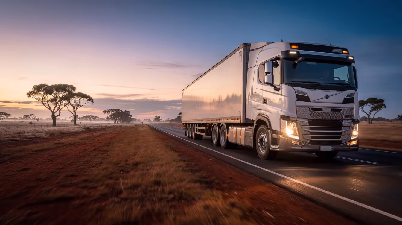
📦 Where Australia Loses $2 Billion in Freight Every Year
Check out the interactive map →
Company News


"Hey Claude, take these 30,000 freight claims and turn them into a map."
If only it were that simple.
Last week we published the FreightInsure freight claims map. It plots more than 30,000 claims on the real routes the freight took when shift happened. Since it went live, the feedback has been generous. And one question keeps coming back: how did you make it?
When you have 30,000 rows of origins, destinations and claim values, one idea jumps out. Put it on a map.
The first version took ten minutes. Load the locations into Google Maps, drop the pins, done. Felt great for about thirty seconds.
Then I looked at it properly. Hundreds of isolated dots floating on a map don't tell you anything. They don't show where freight actually goes wrong. They just show where things start and stop, which is the least interesting part of the whole journey.
Freight doesn't teleport. A package doesn't blink from a Sydney warehouse to a Perth loading dock. It travels. Down highways, across the Nullarbor, through every regional hub in between. That journey is where the risk lives, and it was a far more interesting way to read the data.
So, full of confidence, I typed the obvious next prompt.
"Hey Claude, can you plot the routes between each origin and destination on a map?"
Reader, it was not so simple.
I started out thinking AI would build the thing for me. One prompt, one map. What actually happened was a back and forth that ran for days, where the AI did the heavy lifting and I made the calls. AI assisted, not AI built. That distinction changed everything about how the project went.
The first real problem was scale. Routing 30,000 claims meant finding the unique journeys inside them, which came to around 5,000 origin and destination pairs.
So we built a small chain of scripts that ran in Google Colab. One cleaned the data and pulled out those unique pairs. Another drew a route between every single one using OSRM, an open source routing engine that maps the shortest sensible path along real road networks. The same kind of logic your phone uses to get you home.
The first full routing run took about twelve hours. It finished overnight and produced a single file.
That file was over four gigabytes.
For context, that is not a map. That is a small hard drive's worth of map. No browser on earth was going to open it without falling over. I had asked for directions five thousand times, and I'd been handed every turn, every kink in the road, every roundabout, in forensic detail.
This is the moment that taught me the most. AI will happily show you the path. It will not walk it for you. The model did exactly what I asked. The judgement about whether four gigabytes was a sane answer was mine to bring, and I hadn't brought it yet.
The fix was something I now describe with the casual confidence of a seasoned mapping expert. In reality it was a long, slightly painful process of figuring it out as I went.
The trick was to stop treating every part of a journey as equally important. So we built a three tier approach. The first and last 25 kilometres of each route stayed in high detail, because that's where the hubs, the cities and the action are. The long straight stretches across the highways and the outback got simplified right down, because nobody needs every gentle bend of the Stuart Highway rendered in full.
That kept the detail where you'd zoom in, and kept the map light enough to actually use when you pulled back to see the whole country.
The number we were chasing was 25 megabytes. That was the ceiling for Kepler, the open source tool we were using to visualise it all. We got under it. From four gigabytes to twenty five megabytes, with the story still intact.
Here's the thing. We had a beautiful, technically impressive map of the entire freight network. And it was still a bit boring.
You could click around it forever and not really learn anything. The routes looked great. The insight wasn't landing. Pretty is not the same as meaningful.
Around the same time, the ABC published one of their Story Lab pieces, on the Strait of Hormuz. If you haven't come across Story Lab, it's where they use data to actually tell a story, scrolling you through it one beat at a time. People call the format scrollytelling. You scroll, the visuals respond, and the data unfolds like a narrative instead of sitting there waiting to be poked.
That was the missing piece.
I gave it one prompt. Take the mapping data, find the most interesting insight for each capital city, and turn it into an interactive scrolling story.
It nailed it on the first go. I almost fell off my seat.
What came back was the backbone of what's now live. Eleven chapters, built on a production mapping engine, walking you city by city through where freight goes wrong and what it costs. The same data that felt hollow as a static map suddenly had a pulse.
A few things stuck with me, and they're the reason I wanted to write this down.
You don't need to be an expert to start. I knew nothing about routing engines or geospatial file formats when I began. I knew what a good answer looked like, and I was willing to keep going until I got one. That turned out to be enough.
The hard part isn't the generating. It's the judgement. Knowing the pins weren't a story. Knowing four gigabytes was the wrong answer. Knowing a pretty map still wasn't doing its job. AI is fast and tireless and occasionally brilliant, but it doesn't know what good looks like for your audience. You do. That's the part of the job that isn't going anywhere.
The map is live, and we'd love you to get lost in it. Explore the freight claims map and see where freight goes wrong across the country.
But the bigger invitation is this. If you sit in a product or marketing team and you've got an idea sketched on the back of something, plus a spreadsheet you've been ignoring, that's a starting point. You don't need a data team or a six month roadmap. You need a clear idea of what good looks like, and the patience to keep walking the path once AI points the way.
If I can build a national freight map without knowing what OSRM stood for, you can build the thing you've been putting off.
Industry Insights
Company News
.avif)
Industry Insights